Skip to main content
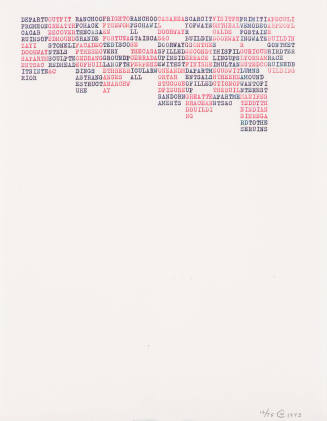
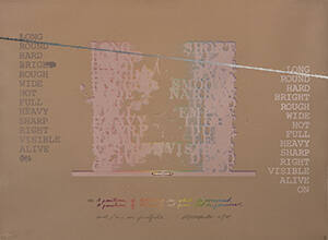
The print resembles a blueprint or a technical drawing, which helps to reinforce its sense of rationality. Within this horizontal composition are four columns of words. There are three columns, left justified, with single words in all capitals; scanning the image from left to right, these words are identical in the first, second, and fourth columns. The two inside columns use stencil lettering, reminiscent of the work of Arakawa’s contemporary, the post-Abstract Expressionist artist Jasper Johns. The third column, right justified, lists the homonyms of the words in the other columns. The paired word opposites are: long/short; round/flat; hard/soft; bright/dark; rough/smooth; wide/narrow; hot/cold; full/empty; heavy/light; sharp/dull; right/left; visible/invisible; alive/dead; on/off. Because the words are repeated in three columns with one column of opposites, it is possible to determine the words even when individual letters are smudged or otherwise obliterated. A line, printed in variegated colors and with a textured outline reminiscent of string, extends across the entire width of the composition. The line slopes downward to the right and runs below the first word, “long,” of columns one and four, so the fourth column is placed lower than the other three.
Between columns two and three, in the negative space created by the left and right justifications of those columns, is printed an upside-down single-stem rose, next to a blind-embossed upright bud vase. A tiny right arrow can be seen to the right of the rose, pointing in the general direction of the word “light” in column three. Columns two and three are placed above an embossed line, like a plinth. Below this, center justified, is a balancing level that construction workers might use. Below the level are two sentences, written in cursive as a postscript, and centered one over the other:
P.S. A position of believing in what is perceived/
A position of believing out from what is perceived
The ambiguity of the printed content and implied context is enhanced through Arakawa’s skillful manipulation of color areas within the composition. The background of the print is a blend in which the slightly shifting colors appear pixilated, giving an overall shimmering quality to the work. The sentences were printed in a rainbow roll inking process. The linguist and semiotician Jean-Francois Lyotard called Arakawa’s epigrams, “visual koans.” [1] This phrase refers to Zen Buddhist meditative practice that challenges logic and promotes contemplation in order to stimulate enlightened thought.
In and/or in profile Arakawa makes it clear that rationality breaks down. It is possible for the viewer to stand to the side and in the process of looking (or reading) left to right, see a column “disappear,” only to have it “reappear” when moving directly in front of the print and to the other side. The effect of the shimmering surface on which opposing words appear and disappear is comparable to the perceptual shift in understanding the sentence’s meaning when “in” is replaced by “out (from).” The word “position” refers to a fixed point, or an intellectual stand, that is easily dislodged by the context of the sentence much as the flower in the vase has been upended. The line traversing the picture plane is “long” and resembles an intellectual tight wire that consistently challenges the viewer as s/he considers all the options.
Notes:
[1] Jean-Francois Lyotard, “Longitude 180 W or E,” Padiglione d’arte Contemporanea di Milano. (Milan: PAC, 1984).
ProvenanceTo 1983
Barbara B. Millhouse, New York, NY and Winston-Salem, NC. [1]
From 1983
Reynolda House Museum of American Art, Winston-Salem, NC, given by Barbara B. Millhouse on December 29, 1983. [2]
Notes:
[1] Deed of Gift, object file.
[2] See note 1.
Exhibition History1976
Twentieth Century American Print Collection opening
Reynolda House Museum of American Art, Winston-Salem, NC (12/3/1976)
2007-2008
Word Play: Text and Modern Art
Reynolda House Museum of American Art, Winston-Salem, NC (11/13/2007-5/4/2008)
2016-2018
Off the Wall: Postmodern Art at Reynolda
Reynolda House Museum of American Art, Winston-Salem, NC (12/3/2016-6/11/2018)
Published References

DepartmentAmerican Art
and/or in profile
Artist
Shusaku Arakawa
(1936 - 2010)
Date1975
Mediumcolor lithograph, silkscreen, and embossing with collage additions (level)
DimensionsFrame: 40 1/2 x 51 3/4 in. (102.9 x 131.4 cm)
Paper: 31 x 42 1/2 in. (78.7 x 108 cm)
Signedand/or in profile Arakawa 1/75
Credit LineGift of Barbara B. Millhouse
CopyrightCopyright Unknown
Object number1983.2.29
DescriptionThe lithograph and silkscreen print and/or in profile is a highly conceptual and technically masterful art image by Shusaku Arakawa. He used language and symbols simultaneously as image and text so that a viewer is also a reader. The construction of meaning is both achieved and undone in the process of looking, leaving the viewer to ponder the mutability of both language and art.The print resembles a blueprint or a technical drawing, which helps to reinforce its sense of rationality. Within this horizontal composition are four columns of words. There are three columns, left justified, with single words in all capitals; scanning the image from left to right, these words are identical in the first, second, and fourth columns. The two inside columns use stencil lettering, reminiscent of the work of Arakawa’s contemporary, the post-Abstract Expressionist artist Jasper Johns. The third column, right justified, lists the homonyms of the words in the other columns. The paired word opposites are: long/short; round/flat; hard/soft; bright/dark; rough/smooth; wide/narrow; hot/cold; full/empty; heavy/light; sharp/dull; right/left; visible/invisible; alive/dead; on/off. Because the words are repeated in three columns with one column of opposites, it is possible to determine the words even when individual letters are smudged or otherwise obliterated. A line, printed in variegated colors and with a textured outline reminiscent of string, extends across the entire width of the composition. The line slopes downward to the right and runs below the first word, “long,” of columns one and four, so the fourth column is placed lower than the other three.
Between columns two and three, in the negative space created by the left and right justifications of those columns, is printed an upside-down single-stem rose, next to a blind-embossed upright bud vase. A tiny right arrow can be seen to the right of the rose, pointing in the general direction of the word “light” in column three. Columns two and three are placed above an embossed line, like a plinth. Below this, center justified, is a balancing level that construction workers might use. Below the level are two sentences, written in cursive as a postscript, and centered one over the other:
P.S. A position of believing in what is perceived/
A position of believing out from what is perceived
The ambiguity of the printed content and implied context is enhanced through Arakawa’s skillful manipulation of color areas within the composition. The background of the print is a blend in which the slightly shifting colors appear pixilated, giving an overall shimmering quality to the work. The sentences were printed in a rainbow roll inking process. The linguist and semiotician Jean-Francois Lyotard called Arakawa’s epigrams, “visual koans.” [1] This phrase refers to Zen Buddhist meditative practice that challenges logic and promotes contemplation in order to stimulate enlightened thought.
In and/or in profile Arakawa makes it clear that rationality breaks down. It is possible for the viewer to stand to the side and in the process of looking (or reading) left to right, see a column “disappear,” only to have it “reappear” when moving directly in front of the print and to the other side. The effect of the shimmering surface on which opposing words appear and disappear is comparable to the perceptual shift in understanding the sentence’s meaning when “in” is replaced by “out (from).” The word “position” refers to a fixed point, or an intellectual stand, that is easily dislodged by the context of the sentence much as the flower in the vase has been upended. The line traversing the picture plane is “long” and resembles an intellectual tight wire that consistently challenges the viewer as s/he considers all the options.
Notes:
[1] Jean-Francois Lyotard, “Longitude 180 W or E,” Padiglione d’arte Contemporanea di Milano. (Milan: PAC, 1984).
ProvenanceTo 1983
Barbara B. Millhouse, New York, NY and Winston-Salem, NC. [1]
From 1983
Reynolda House Museum of American Art, Winston-Salem, NC, given by Barbara B. Millhouse on December 29, 1983. [2]
Notes:
[1] Deed of Gift, object file.
[2] See note 1.
Exhibition History1976
Twentieth Century American Print Collection opening
Reynolda House Museum of American Art, Winston-Salem, NC (12/3/1976)
2007-2008
Word Play: Text and Modern Art
Reynolda House Museum of American Art, Winston-Salem, NC (11/13/2007-5/4/2008)
2016-2018
Off the Wall: Postmodern Art at Reynolda
Reynolda House Museum of American Art, Winston-Salem, NC (12/3/2016-6/11/2018)
Published References
Status
Not on viewCollections
1917-1918