Skip to main content
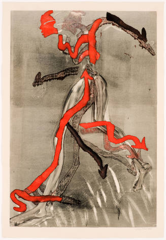
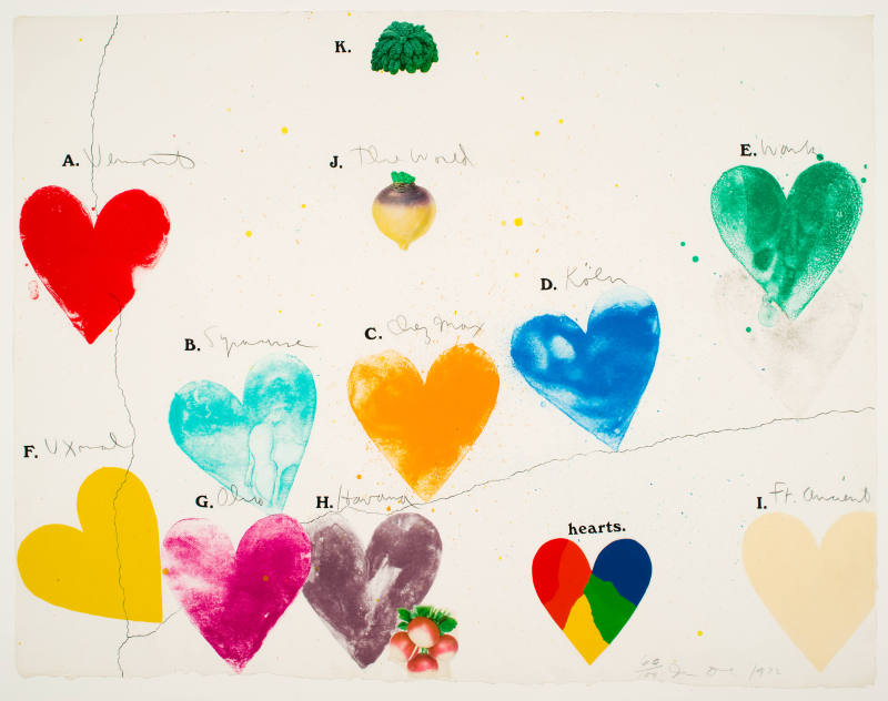
The World (for Anne Waldman) is a tribute to Waldman, a New York-based poet known for her experimental work as well as her political activism. She has been a collaborator with both visual artists and musicians and is often associated with the Beat Generation, a label that suits her about as well as Pop Art fits Dine.
In The World (for Anne Waldman), a series of colorful hearts is arrayed across the print like shapes on a map. Places of significance to Dine are identified with handwritten notations, beginning in the upper left with Vermont, a reference to his residence there for fourteen years, to Ft. Ancient in the lower right, a Native American site northeast of Cincinnati, his childhood home. Similarly, other hearts are labeled with place names: Ohio, Syracuse, Uxmal, Köln, and Havana, while, more enigmatically, the green heart in the upper right is “work” and the yellow one in the middle is “chez Max.” Along the central axis he inserted three vegetables: kale, a turnip, and radishes, rare instances of Dine using silkscreen to implant mass-produced photomechanical images. The turnip resembles a spinning top and above it is scrawled “the world,” an obvious pun. Stencil letters, from A to K, accompany each image, but are not arranged in alphabetical order.
Hearts—an iconic theme Dine began to employ in the mid-1960s and continues to work with today––are overt expressions of affection. He once remarked on his passion for this symbol: “As a kid I liked Valentine’s Day, not because I was in love, necessarily, but because I loved the redness of it. It’s everything really, a vagina, an ass; it’s pretty basic stuff, this cleaved, full object. When I first used the heart I didn’t know it would become an abiding theme. Typically, though, I always go where my romance takes me, so it is an emblem that I return to with a lot of affection.” [2] Interestingly, in The World (for Anne Waldman) Dine manipulated colors so that only Vermont is a deeply saturated red, while most of the other colors are more muted. The image called “hearts,” the only one without a stenciled letter, consists of four intense colors: red, blue, green, and yellow, defined by crisp edges reminiscent of shapes on a map.
A combination of lithography from zinc plates, silkscreen, block print, and pencil, The World (for Anne Waldman) is a testament to Dine’s skill as a printmaker. Printed in eleven colors on handmade Hodgkinson paper, it bears the artist’s watermark along with that of his collaborator, the Petersburg Press of London. The print was produced in 1971, the year in which Dine announced he had reached his stride with printmaking.
Notes:
[1] Dine interview with Thomas Krens, “Conversations with Jim Dine,” Jim Dine Prints: 1970–1977 (New York: Harper & Row, 1977), 15.
[2] Dine quoted in Graham W.J. Beal, Robert Creely, Jim Dine, and Martin Friedman, Jim Dine: Five Themes (Minneapolis: Walker Art Center, 1984), 36.
ProvenanceTo 1983
Barbara B. Millhouse, New York, NY and Winston-Salem, NC. [1]
From 1983
Reynolda House Museum of American Art, Winston-Salem, NC, given by Barbara B. Millhouse on December 29, 1983. [2]
Notes:
[1] Deed of Gift, object file.
[2] See note 1.
Exhibition History1976
Twentieth Century American Print Collection opening
Reynolda House Museum of American Art, Winston-Salem, NC (12/3/1976)
2006-2007
Modern Fun: Prints from the ’70s and ’80s
Reynolda House Museum of American Art, Winston-Salem, NC (10/3/2006-1/28/2007)
Published ReferencesReynolda House Annual Report. Winston-Salem NC: Wake Forest University, 2003.

DepartmentAmerican Art
The World (for Anne Waldman)
Artist
Jim Dine
(born 1935)
Date1972
Mediumlithography from zinc plates, silkscreen, block print/woodblock, and pencil on handmade Hodgkinson paper
DimensionsFrame: 35 1/4 x 45 1/4 in. (89.5 x 114.9 cm)
Paper (uneven edges): 30 1/2 x 40 1/4 in. (77.5 x 102.2 cm)
SignedJim Dine 1972
Credit LineGift of Barbara B. Millhouse
Copyright© 2021 Jim Dine / Artists Rights Society (ARS), New York
Object number1983.2.15
DescriptionAs one who suffers from dyslexia, Jim Dine finds he has an affinity with poetry––personally meaningful words often arranged in an unorthodox manner. He attempted to write poems because, as he explained: “During the sixties in New York, I found I was having difficulty identifying with the work of other visual artists. I didn’t find any true comrades among my peers in art. But I didn’t seem to have that difficulty with some poets. Maybe because I am a much more literary person. But I can’t quite believe that. I did write some poetry in the late sixties and found that I wasn’t a writer. The point is, I felt their minds were more subtle and more receptive to what I had to say, and they were more interesting to talk to and to relate to socially, not that they knew any more about art than anybody else.” [1] The World (for Anne Waldman) is a tribute to Waldman, a New York-based poet known for her experimental work as well as her political activism. She has been a collaborator with both visual artists and musicians and is often associated with the Beat Generation, a label that suits her about as well as Pop Art fits Dine.
In The World (for Anne Waldman), a series of colorful hearts is arrayed across the print like shapes on a map. Places of significance to Dine are identified with handwritten notations, beginning in the upper left with Vermont, a reference to his residence there for fourteen years, to Ft. Ancient in the lower right, a Native American site northeast of Cincinnati, his childhood home. Similarly, other hearts are labeled with place names: Ohio, Syracuse, Uxmal, Köln, and Havana, while, more enigmatically, the green heart in the upper right is “work” and the yellow one in the middle is “chez Max.” Along the central axis he inserted three vegetables: kale, a turnip, and radishes, rare instances of Dine using silkscreen to implant mass-produced photomechanical images. The turnip resembles a spinning top and above it is scrawled “the world,” an obvious pun. Stencil letters, from A to K, accompany each image, but are not arranged in alphabetical order.
Hearts—an iconic theme Dine began to employ in the mid-1960s and continues to work with today––are overt expressions of affection. He once remarked on his passion for this symbol: “As a kid I liked Valentine’s Day, not because I was in love, necessarily, but because I loved the redness of it. It’s everything really, a vagina, an ass; it’s pretty basic stuff, this cleaved, full object. When I first used the heart I didn’t know it would become an abiding theme. Typically, though, I always go where my romance takes me, so it is an emblem that I return to with a lot of affection.” [2] Interestingly, in The World (for Anne Waldman) Dine manipulated colors so that only Vermont is a deeply saturated red, while most of the other colors are more muted. The image called “hearts,” the only one without a stenciled letter, consists of four intense colors: red, blue, green, and yellow, defined by crisp edges reminiscent of shapes on a map.
A combination of lithography from zinc plates, silkscreen, block print, and pencil, The World (for Anne Waldman) is a testament to Dine’s skill as a printmaker. Printed in eleven colors on handmade Hodgkinson paper, it bears the artist’s watermark along with that of his collaborator, the Petersburg Press of London. The print was produced in 1971, the year in which Dine announced he had reached his stride with printmaking.
Notes:
[1] Dine interview with Thomas Krens, “Conversations with Jim Dine,” Jim Dine Prints: 1970–1977 (New York: Harper & Row, 1977), 15.
[2] Dine quoted in Graham W.J. Beal, Robert Creely, Jim Dine, and Martin Friedman, Jim Dine: Five Themes (Minneapolis: Walker Art Center, 1984), 36.
ProvenanceTo 1983
Barbara B. Millhouse, New York, NY and Winston-Salem, NC. [1]
From 1983
Reynolda House Museum of American Art, Winston-Salem, NC, given by Barbara B. Millhouse on December 29, 1983. [2]
Notes:
[1] Deed of Gift, object file.
[2] See note 1.
Exhibition History1976
Twentieth Century American Print Collection opening
Reynolda House Museum of American Art, Winston-Salem, NC (12/3/1976)
2006-2007
Modern Fun: Prints from the ’70s and ’80s
Reynolda House Museum of American Art, Winston-Salem, NC (10/3/2006-1/28/2007)
Published ReferencesReynolda House Annual Report. Winston-Salem NC: Wake Forest University, 2003.
Status
Not on viewCollections