Skip to main content
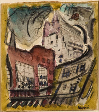
F.W., an etching with aquatint, is a perfect ten-inch square, emphasized by its dramatic compositional cropping. The image is presented as though seen from street level, looking up the façade of a multi-level commercial building. Two different establishments are shown adjacent to each other, but the image is so closely cropped it is unclear what type of business is on the left. Only its name—in neon lights—is hinted at, ending with the letter “S.” This store, too, has a striped awning, but of a contrasting pattern. Even as a partial view in black and white, the signature awning and typeface of the Woolworth’s logo makes its identification clear. The commercial aspect of the signage belies the image’s more abstract qualities. Pictorial depth of field is suggested by the downward right-hand slant of the awning and sign. The composition includes straight lines in the awning stripes, the building trim, the upper story casement windows, and the letters of the Woolworth sign. Curvilinear forms are found in the awning ruffle, the neon letter “S,” and the architectural bracket on the Woolworth building. The tonal qualities of this image masterfully evoke the sight and memory of sunlight and shadow on stone, neon, metal, and fabric.
Cottingham’s artistic process is based on photographs of urban landscapes that he took on trips around the United States, often traveling by bus so that he could see the more decrepit and commercial areas of a city. Once a photograph is selected, the artist decides the final size of the painting or print, and then crops his source photograph to fit those predetermined measurements. He then draws the image on vellum using a soft graphite pencil, working out a full tonal range from white to black, but ultimately determining a minimal number of intermittent grays to strengthen the image’s graphic quality and impact. An oil painting rendered in color from the same photograph conveys a very different sensation.
Printed at Landfall Press in Chicago in early 1975, F.W. was Cottingham’s first experience with the technique of etching. Master printer Jack Lemon supervised the edition of fifty, which was printed from a single copper plate and required thirteen applications of rosin for the aquatint, followed by etching, stop-varnishing, and burnishing. [1] The highlights or whites of the print are achieved by careful hand burnishing of the metal surface to an absolute smoothness so that nothing will catch ink, and the clean metal will effectively print as white. F. W. is enhanced with chine-collé, the addition of a Japanese mulberry paper on the square surface where the image is printed. This time-consuming and laborious process demands great technical finesse, but it also guarantees a final product that is harmonious with the image rendered.
Notes:
[1] For details on the printing process see John Arthur, Robert Cottingham: A Print Retrospective 1972-1986. Exhibition catalogue and catalogue raisonné by William C. Landwehr (Springfield, Missouri: Springfield Art Museum),1986, and Stephen M. Doherty. “Robert Cottingham: An Unabashed Realist,” American Artist, 43 (July 1979), 48–53, 110.
ProvenanceTo 1983
Barbara B. Millhouse, New York, NY and Winston-Salem, NC. [1]
From 1983
Reynolda House Museum of American Art, Winston-Salem, NC, given by Barbara B. Millhouse on December 29, 1983. [2]
Notes:
[1] Deed of Gift, object file.
[2] See note 1.
Exhibition History1976
Twentieth Century American Print Collection opening
Reynolda House Museum of American Art, Winston-Salem, NC (12/3/1976)
2007-2008
Word Play: Text and Modern Art
Reynolda House Museum of American Art, Winston-Salem, NC (11/13/2007-5/4/2008)
2022
Chrome Dreams and Infinite Reflections: American Photorealsim
Reynolda House Museum of American Art, Winston-Salem, NC (7/15/2022-12/31/2022)
Published References
DepartmentAmerican Art
F.W.
Artist
Robert Cottingham
(born 1935)
Date1975
Mediumetching, aquatint, and chine-collé
DimensionsFrame: 31 3/4 x 25 3/4 in. (80.6 x 65.4 cm)
Image: 10 1/2 x 10 1/2 in. (26.7 x 26.7 cm)
Paper (approximate): 28 1/2 x 22 5/8 in. (72.4 x 57.5 cm)
SignedCOTTINGHAM 75
Credit LineGift of Barbara B. Millhouse
CopyrightLandfall Press
Object number1983.2.30
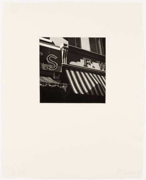
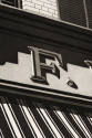
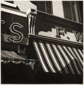
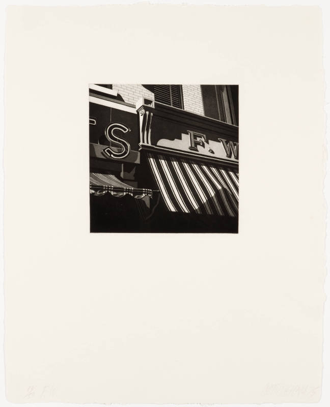
DescriptionF. W. Woolworth stores, the national retail chain of five-and-dime stores, were a ubiquitous feature of the American urban scene until they went out of business in this country in 1997. In Robert Cottingham’s print, F.W., the distinctive lettering above a striped awning is instantly recognizable to anyone born before the 1970s, and conjures memories of inexpensive purchases and lunch counters. A powerful historic association with the store is the series of sit-ins in Greensboro, North Carolina, during the Civil Rights Movement; on February 1, 1960, four African-American students from North Carolina Agricultural and Technical College sought and were refused service at the downtown F. W. Woolworth “for whites only” lunch counter. As a result of persistent non-violent protest and the spread of the boycott to other cities, F.W. Woolworth ended its policy of desegregation throughout its national chain six months later. F.W., an etching with aquatint, is a perfect ten-inch square, emphasized by its dramatic compositional cropping. The image is presented as though seen from street level, looking up the façade of a multi-level commercial building. Two different establishments are shown adjacent to each other, but the image is so closely cropped it is unclear what type of business is on the left. Only its name—in neon lights—is hinted at, ending with the letter “S.” This store, too, has a striped awning, but of a contrasting pattern. Even as a partial view in black and white, the signature awning and typeface of the Woolworth’s logo makes its identification clear. The commercial aspect of the signage belies the image’s more abstract qualities. Pictorial depth of field is suggested by the downward right-hand slant of the awning and sign. The composition includes straight lines in the awning stripes, the building trim, the upper story casement windows, and the letters of the Woolworth sign. Curvilinear forms are found in the awning ruffle, the neon letter “S,” and the architectural bracket on the Woolworth building. The tonal qualities of this image masterfully evoke the sight and memory of sunlight and shadow on stone, neon, metal, and fabric.
Cottingham’s artistic process is based on photographs of urban landscapes that he took on trips around the United States, often traveling by bus so that he could see the more decrepit and commercial areas of a city. Once a photograph is selected, the artist decides the final size of the painting or print, and then crops his source photograph to fit those predetermined measurements. He then draws the image on vellum using a soft graphite pencil, working out a full tonal range from white to black, but ultimately determining a minimal number of intermittent grays to strengthen the image’s graphic quality and impact. An oil painting rendered in color from the same photograph conveys a very different sensation.
Printed at Landfall Press in Chicago in early 1975, F.W. was Cottingham’s first experience with the technique of etching. Master printer Jack Lemon supervised the edition of fifty, which was printed from a single copper plate and required thirteen applications of rosin for the aquatint, followed by etching, stop-varnishing, and burnishing. [1] The highlights or whites of the print are achieved by careful hand burnishing of the metal surface to an absolute smoothness so that nothing will catch ink, and the clean metal will effectively print as white. F. W. is enhanced with chine-collé, the addition of a Japanese mulberry paper on the square surface where the image is printed. This time-consuming and laborious process demands great technical finesse, but it also guarantees a final product that is harmonious with the image rendered.
Notes:
[1] For details on the printing process see John Arthur, Robert Cottingham: A Print Retrospective 1972-1986. Exhibition catalogue and catalogue raisonné by William C. Landwehr (Springfield, Missouri: Springfield Art Museum),1986, and Stephen M. Doherty. “Robert Cottingham: An Unabashed Realist,” American Artist, 43 (July 1979), 48–53, 110.
ProvenanceTo 1983
Barbara B. Millhouse, New York, NY and Winston-Salem, NC. [1]
From 1983
Reynolda House Museum of American Art, Winston-Salem, NC, given by Barbara B. Millhouse on December 29, 1983. [2]
Notes:
[1] Deed of Gift, object file.
[2] See note 1.
Exhibition History1976
Twentieth Century American Print Collection opening
Reynolda House Museum of American Art, Winston-Salem, NC (12/3/1976)
2007-2008
Word Play: Text and Modern Art
Reynolda House Museum of American Art, Winston-Salem, NC (11/13/2007-5/4/2008)
2022
Chrome Dreams and Infinite Reflections: American Photorealsim
Reynolda House Museum of American Art, Winston-Salem, NC (7/15/2022-12/31/2022)
Published References
Status
Not on viewCollections