Skip to main content
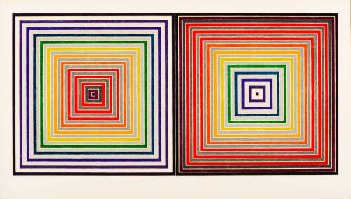
Double Gray Scramble is reminiscent of a much larger work, a painting of Stella’s from a decade earlier, Jasper’s Dilemma, 1962–1963. The title refers to Stella’s friend, the artist Jasper Johns, and his predilection for rendering images in both black and white and color versions. While Double Gray Scramble features concentric color squares, in Jasper’s Dilemma there are mazes created from a central point that, in making continual right turns around the square, become a continuous white line. From each point of the square through these turning points of the maze, there are mitred lines. In the painting, the left square is made of the colors of the visual spectrum—red-orange-yellow-green-blue-indigo/violet—and the right square is black/white/gray, while, in the print, both squares have the spectral colors alternating with the gray scale. Stella was able to resolve some compositional challenges of the earlier painting in the print, chiefly that the former’s mitred mazes have a tendency to torque visually and suggest dimension whereas the print, despite its recessional tendencies, still maintains a surface flatness and remains a two-dimensional image.
The appropriately titled screenprint Double Gray Scramble was produced at the Gemini G.E.L. workshop in Los Angeles under the direction of master printmaker Kenneth Tyler, whom Stella first met when he became an artist-in-resident at the University of California in 1967. Stella has subsequently produced more prints with Tyler than he has with any other master printmaker. Although only three silkscreens were used to make this print, this multi-color image required one hundred fifty press runs, seventy-five colors for the first half, which were then printed in reverse order for the second half. The flat blacks, whites, twelve grays, and twelve color hues were printed from a photo screen, while the transparent black, white, twelve grays, and twelve hues were printed from a hand-cut screen stencil. [2] Three screens were used for the flat bands of the colors, the textured bands of the colors, and the gray scale bands in between the printed colors. Each flat color was printed between two textures of color. Although not obvious to the casual viewer, the straightforwardness of the image belies the logistical complexity of its production.
Notes:
[1]Rubin, William. Frank Stella. New York: The Museum of Modern Art, 1970.
[2]According to the Gemini G.E.L. online catalogue raisonné, http://www.nga.gov/fcgi-bin/gemini.pl. The twelve color hues are red-violet, red, red-orange, orange, orange-yellow, yellow, yellow-green, green, green-blue, blue, blue-violet, and violet.
ProvenanceTo 1983
Barbara B. Millhouse, New York, NY and Winston-Salem, NC. [1]
From 1983
Reynolda House Museum of American Art, Winston-Salem, NC, given by Barbara B. Millhouse on December 29, 1983. [2]
Notes:
[1] Deed of Gift, object file.
[2] See note 1.
Exhibition History1976
Twentieth Century American Print Collection opening
Reynolda House Museum of American Art, Winston-Salem, NC (12/3/1976)
Published ReferencesReynolda House Museum of American Art, Reynolda: Her Muses, Her Stories , with contributions by Martha R. Severens and David Park Curry (Winston-Salem, N.C.: Reynolda House Museum of American Art affiliated with Wake Forest University, 2017). pg. 190, 191
DepartmentAmerican Art
Double Gray Scramble
Artist
Frank Stella
(American, 1936 - 2024)
Date1973
Medium150-color screenprint
DimensionsFrame: 30 1/4 x 52 in. (76.8 x 132.1 cm)
Image: 23 1/2 x 47 in. (59.7 x 119.4 cm)
Paper: 29 x 50 3/4 in. (73.7 x 128.9 cm)
SignedF. Stella '73
Credit LineGift of Barbara B. Millhouse
Copyright© Frank Stella / Artists Rights Society (ARS), New York
Object number1983.2.20
DescriptionIn an oft-repeated statement, Frank Stella said of his Minimalist stripe paintings, “What you see is what you see,” although he did add, “but the worthwhile qualities of painting are always going to be both visual and emotional, and it’s got to be a convincing emotional experience.” [1] His screenprint Double Gray Scramble reflects this attitude in its depiction of a centered pair of squares, each comprised of progressively smaller concentric squares. On the left, within the black border, the largest and outermost square is a dark indigo and the smaller squares progress from blue to green, yellow, orange and red. On the right, the largest square is dark red, and the interior squares progress from red, orange, and yellow before becoming green, blue, and indigo. Because of these opposite prismatic color progressions, the two-dimensional image functions almost three-dimensionally, with the left square seeming to telescope out from the picture plane while the right square appears to recede inwardly from the picture plane. In each, the central innermost black square is identical, yet because one is surrounded by a dark shade and the other by a light tint, they look unequal in size. Although Stella is primarily associated with Minimalism, especially in his earlier work, the print’s repetitive pattern and implied recessional space link it more to the Op or Optical Art movement of the 1960s and 1970s.Double Gray Scramble is reminiscent of a much larger work, a painting of Stella’s from a decade earlier, Jasper’s Dilemma, 1962–1963. The title refers to Stella’s friend, the artist Jasper Johns, and his predilection for rendering images in both black and white and color versions. While Double Gray Scramble features concentric color squares, in Jasper’s Dilemma there are mazes created from a central point that, in making continual right turns around the square, become a continuous white line. From each point of the square through these turning points of the maze, there are mitred lines. In the painting, the left square is made of the colors of the visual spectrum—red-orange-yellow-green-blue-indigo/violet—and the right square is black/white/gray, while, in the print, both squares have the spectral colors alternating with the gray scale. Stella was able to resolve some compositional challenges of the earlier painting in the print, chiefly that the former’s mitred mazes have a tendency to torque visually and suggest dimension whereas the print, despite its recessional tendencies, still maintains a surface flatness and remains a two-dimensional image.
The appropriately titled screenprint Double Gray Scramble was produced at the Gemini G.E.L. workshop in Los Angeles under the direction of master printmaker Kenneth Tyler, whom Stella first met when he became an artist-in-resident at the University of California in 1967. Stella has subsequently produced more prints with Tyler than he has with any other master printmaker. Although only three silkscreens were used to make this print, this multi-color image required one hundred fifty press runs, seventy-five colors for the first half, which were then printed in reverse order for the second half. The flat blacks, whites, twelve grays, and twelve color hues were printed from a photo screen, while the transparent black, white, twelve grays, and twelve hues were printed from a hand-cut screen stencil. [2] Three screens were used for the flat bands of the colors, the textured bands of the colors, and the gray scale bands in between the printed colors. Each flat color was printed between two textures of color. Although not obvious to the casual viewer, the straightforwardness of the image belies the logistical complexity of its production.
Notes:
[1]Rubin, William. Frank Stella. New York: The Museum of Modern Art, 1970.
[2]According to the Gemini G.E.L. online catalogue raisonné, http://www.nga.gov/fcgi-bin/gemini.pl. The twelve color hues are red-violet, red, red-orange, orange, orange-yellow, yellow, yellow-green, green, green-blue, blue, blue-violet, and violet.
ProvenanceTo 1983
Barbara B. Millhouse, New York, NY and Winston-Salem, NC. [1]
From 1983
Reynolda House Museum of American Art, Winston-Salem, NC, given by Barbara B. Millhouse on December 29, 1983. [2]
Notes:
[1] Deed of Gift, object file.
[2] See note 1.
Exhibition History1976
Twentieth Century American Print Collection opening
Reynolda House Museum of American Art, Winston-Salem, NC (12/3/1976)
Published ReferencesReynolda House Museum of American Art, Reynolda: Her Muses, Her Stories , with contributions by Martha R. Severens and David Park Curry (Winston-Salem, N.C.: Reynolda House Museum of American Art affiliated with Wake Forest University, 2017). pg. 190, 191
Status
Not on viewCollections